
The game seems to be about bitcoins, and winning actual bitcoins (and maybe players have to use
bitcoins to even play your game). I think that adds a very large hurdle blocking your game's accessibility
and attractiveness. I think bitcoins are dodgy, and maybe a lot of other people feel the same way I do.
I think games in which you can win real money are dodgy - and maybe your potential players feel the same way
I do.
Lastly, I echo the comments above about the graphics: they don't inspire confidence in, or curiosity about,
one's prospects of having a good time with the pictured game. Instead of questioning each criticism and
drawing comparisons with other games, rather take the advice to get a good artist.
🎉 Celebrating 25 Years of GameDev.net! 🎉
Not many can claim 25 years on the Internet! Join us in celebrating this milestone. Learn more about our history, and thank you for being a part of our community!
My First Videogame Failed Conquering The Market

2D gameplay with 3D graphics is fine.
The graphics are definitely ugly for a game from the 2012, but still had 176k plays!
Ugly graphics and over 150.000 downloads both on GameJolt and Play Store
There must be something related to either gameplay, or the fact people thinks there is a bitcoin miner/malware inside my game i think.
It's likely not one thing that drives away all your customers. Likely some segment is driven away by bad graphics, another segment by bad gameplay (you can sorta detect this by your user metrics - did they play for ten minutes and never return?), another segment by never having heard of the game in the first place.
For me, I see this and it drives me away:

Since you want feedback, I take a second look and see the graphics actually aren't all that bad, but it has some garrish issues that prevent me from seeing that on my first glance - and most players will probably only give you that glance.
If you look at the picture as a whole, it is an vibrant lime-green burning my eyes like acid. The 3D modelling isn't bad, but the brightness of the yellow-green is pretty intense. I think even digitally altering this one image may get people in-game.
The problem is, a customer's eyes has to adjust to the garishness of the image before seeing that it doesn't look bad, but they aren't going to wait.
The second problem is, your eyes are already adjusted to it, so it's hard for you to see it. Try setting it as your desktop background, so you see it at unexpected times when your mind isn't prepared for it.
I think the game also suffers from a lack of shading. The bitcoin is flat, the blue arrow is flat, the fences don't seem to cast shadows.
Also your text is hard to read. Where it says "the bittles", for some reason the first word is in all lowercase, and the second word is in all uppercase. The first word is in one font, the second in another font. The first word is near invisible, and the second has a bunch of dots making it hard to read.
Honestly, I couldn't see the first word at all, and the second word at a glance looks like it says BITCHES rather than BITLES.
Further, "Bitles" is actually spelled wrong. I know it's a word you made up for your game, but it's actually spelled with two T's, unless you're localizing into French. English has rules and a certain feel to it, so even made-up words need to follow that.
I don't know the specific rules involved here, but intuitively:
"Bitles" reads as "Bit less"
"Bittles" reads as "Bit tolls" (i.e. "a small bit")
Don't get discouraged. You've completed a game, which is incredible!
The problem now is, your game needs to be polished and refined.
I don't know the source of the quote, but "Polish is everything you do to improve your work AFTER you thought you were finished."
Or you can roll the knowledge gained into your next project... but to do that, you have to actually understand what's wrong about this project, or you might just repeat the same mistakes.
Oh, and I haven't played your game, I just saw that single image I re-posted in this post.

Author
The game seems to be about bitcoins, and winning actual bitcoins (and maybe players have to use
bitcoins to even play your game). I think that adds a very large hurdle blocking your game's accessibility
and attractiveness. I think bitcoins are dodgy, and maybe a lot of other people feel the same way I do.
I think games in which you can win real money are dodgy - and maybe your potential players feel the same way
I do.
Lastly, I echo the comments above about the graphics: they don't inspire confidence in, or curiosity about,
one's prospects of having a good time with the pictured game. Instead of questioning each criticism and
drawing comparisons with other games, rather take the advice to get a good artist.
Thanks.
But why do you discourage comparing with other games? It is useful for understanding what went wrong and improving in analyzing the market, i guess.
And i'm sure every game market researcher analyses other games all the time
About the "dodgy" yes, i think that is a major factor that drove players away.
And maybe also the fact that it is about bitcoins, but most people are not into them, so they felt like "it's not something for me, i'll pass"
Author
2D gameplay with 3D graphics is fine.
The graphics are definitely ugly for a game from the 2012, but still had 176k plays!
Ugly graphics and over 150.000 downloads both on GameJolt and Play Store
There must be something related to either gameplay, or the fact people thinks there is a bitcoin miner/malware inside my game i think.
It's likely not one thing that drives away all your customers. Likely some segment is driven away by bad graphics, another segment by bad gameplay (you can sorta detect this by your user metrics - did they play for ten minutes and never return?), another segment by never having heard of the game in the first place.
For me, I see this and it drives me away:
Since you want feedback, I take a second look and see the graphics actually aren't all that bad, but it has some garrish issues that prevent me from seeing that on my first glance - and most players will probably only give you that glance.
If you look at the picture as a whole, it is an vibrant lime-green burning my eyes like acid. The 3D modelling isn't bad, but the brightness of the yellow-green is pretty intense. I think even digitally altering this one image may get people in-game.
The problem is, a customer's eyes has to adjust to the garishness of the image before seeing that it doesn't look bad, but they aren't going to wait.
The second problem is, your eyes are already adjusted to it, so it's hard for you to see it. Try setting it as your desktop background, so you see it at unexpected times when your mind isn't prepared for it.
I think the game also suffers from a lack of shading. The bitcoin is flat, the blue arrow is flat, the fences don't seem to cast shadows.
Also your text is hard to read. Where it says "the bittles", for some reason the first word is in all lowercase, and the second word is in all uppercase. The first word is in one font, the second in another font. The first word is near invisible, and the second has a bunch of dots making it hard to read.
Honestly, I couldn't see the first word at all, and the second word at a glance looks like it says BITCHES rather than BITLES.
Further, "Bitles" is actually spelled wrong. I know it's a word you made up for your game, but it's actually spelled with two T's, unless you're localizing into French. English has rules and a certain feel to it, so even made-up words need to follow that.
I don't know the specific rules involved here, but intuitively:
"Bitles" reads as "Bit less"
"Bittles" reads as "Bit tolls" (i.e. "a small bit")
Don't get discouraged. You've completed a game, which is incredible!
The problem now is, your game needs to be polished and refined.
I don't know the source of the quote, but "Polish is everything you do to improve your work AFTER you thought you were finished."
Or you can roll the knowledge gained into your next project... but to do that, you have to actually understand what's wrong about this project, or you might just repeat the same mistakes.
Oh, and I haven't played your game, I just saw that single image I re-posted in this post.
Thanks for having taken the time to answer.
Yes i think i will want to learn something from the errors to make a new game better.
About the "too bright lime-yellow", actually i did not notice that, could be due to me being accustomed to it, or my monitor ??
For example this image looks too bright to you? Just to understand

And... yes i understand that for professional graphics i need a dedicated artist, but here we're talking about very garish things , not details, and i just want to make sure my eyes actually work well :)
But why do you discourage comparing with other games? It is useful for understanding what went wrong and improving in analyzing the market, i guess.
I'm just saying that "but my graphics don't look as bad as that game's graphics" isn't going to get you much useful information.
Yes, every game maker should do a competitive analysis. If one of your competitive bullet points is "our graphics don't suck as bad as Game X's graphics," that's not going to boost sales. Pursuant to the Picasso quote above, childlike graphics can be charming, but making them charmingly attractive is hard.
About the "too bright lime-yellow", actually i did not notice that, could be due to me being accustomed to it, or my monitor ??
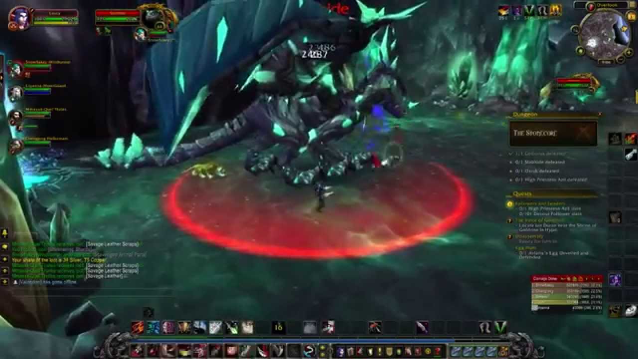
For example this image looks too bright to you? Just to understand
[image]
And... yes i understand that for professional graphics i need a dedicated artist, but here we're talking about very garish things , not details, and i just want to make sure my eyes actually work well :)
You might get a better understanding about art in the Visual Arts forum. Here in the Business forum, we can answer questions about business matters (such as "why doesn't my game sell").
About the "too bright lime-yellow", actually i did not notice that, could be due to me being accustomed to it, or my monitor ??
For example this image looks too bright to you? Just to understand
And... yes i understand that for professional graphics i need a dedicated artist, but here we're talking about very garish things , not details, and i just want to make sure my eyes actually work well :)
That image looks somewhat over the top (moreso when zoomed out, and especially in the upper-right corner), but the biggest problem in that image is the overuse of glow (entire right side of the image) and depth-of-field (entire top). The cell-shaded-esqe thick outlines does help reduce that, somewhat.
It's not necessarily too bright, except in the top of the screenshot and especially in the upper-right corner, but it's too blurry makes it's "somewhat-to-bright" become "hard on the eyes" in general.
Overall this image feels like "lol I hear artists use bloom, so ima use bloom to. lol i hear artists use depth-of-field blurs, so ima use that also. lol i hear artists use X and Y, so ima do that too!". It feels like someone using whatever they see others using, without understanding when and why and how to use them. Sometimes still shots of games look bad, despite the game in-motion looking fine, so that might be the case here.
I'm not sure what game that is, and you'll probably tell me that the game is very successful; all I can personally say is that if that game used that particular screenshot to try and sell itself to me, I wouldn't buy it. The images used for marketing has to be carefully chosen. But I do like their art style (with the cell-shading) even if they overuse special effects.
Nice graphics doesn't always mean expensive complex art. I posted a bunch of screenshots for inspiration in this other thread that might be interesting (not all of them are "good art", but just some ideas).
I'm not an artist, btw. An artist will be able to tell you in more detail what's wrong, I can only say I dislike it, and guess at what combination of things lead to me disliking it. I'm sure in motion it'd probably be alot better, but I'm not seeing a moving image, I'm seeing a static image, and the static image is what is trying to sell me the game. Even video trailers probably won't get watched unless the static images first appeal.

I'm not an artist, btw. An artist will be able to tell you in more detail what's wrong, I can only say I dislike it, and guess at what combination of things lead to me disliking it. I'm sure in motion it'd probably be alot better, but I'm not seeing a moving image, I'm seeing a static image, and the static image is what is trying to sell me the game. Even video trailers probably won't get watched unless the static images first appeal.
There is no clear focus.
Generally unimportant things get boring unsaturated neutral colors. There are a lot of dim browns, muddy reds, dim greens so you don't bother to look at stuff that doesn't matter. Stuff that is important is usually hit with saturated or bright colors and use a lot of contrast. It is something most artists are so practiced at they do it without thought.
Generally level design pulls players toward key items with light and color and patterns. I haven't looked at the game, those might be there but are missing from the picture.
When I look at the image in the post above the first thing that jumps out at at me are the bright green/white leaves, then the bright white and red smoke trails, then the big white and gray walls. I don't particularly notice the health bars over players. It took several seconds of studying the image before noticing there was a big green circle (i) which I assume is for information.
For some comparison, the Super Mario Bros series has always done this particularly well. Primary colors for players, bright yellow for blocks you hit and coins, bold colors for enemies like turtles with bright red shells, blue shells, yellow shells, or high-saturated brown goombas along with their high contrast black-and-white eyes. Backgrounds are distant hills or castles or whatever and are typically muted pastels.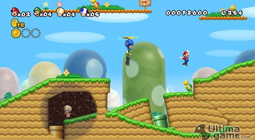
Or a few other images that demonstrate clearly showing the player what they should be looking at. Most have bright lines around players either coming straight through them, or ringing them around the ground, or bright yellow or bright red warnings, etc. Stuff that doesn't matter is dark or muted:


Honestly, I think the major issue is the bitcoins. I see bitcoins and want nothing to do with it. Change that and just make it fun coins in game or something and see how many players you get.
I had my first game as a failure too. The main issue it had was that the gameplay was just average - collect all of the gems in the level and do time trials. Other games do that and more, so why should players favor my game over mine? The art was generic and not really inspiring, either.
Looking at your game:
-The art style burns my eyes. Look at examples from Spyro, Crash Bandicoot or some of the other games which were mentioned further up in the thread. That alone makes me say no.
-No plot development from what I can see. Spyro has a reason why he rescues the dragons in the first game - there is a conflict which is resolved in the final part of the game. Here, we just have a Bitle being greedy for Bitcoins and that's around it.
-The titles (e.g. Vote for Us) look unnecessarily childish.
-There's a stigma of porting mobile games to the PC and putting it on Steam. Just because a mobile game is good, it doesn't necessarily mean that it would be good as a PC title
-As others have said, I'm not a fan of earning bitcoins but to play a great game after a long day.
This topic is closed to new replies.
Advertisement
Popular Topics


Advertisement

